13 August 2012

Review of the MontBlanc 149 by a former anti-montblancite

So, I will be the first to admit that I have said nasty things about MontBlanc, and those who buy their pens.  If you look, you can find all over Fountain Pen Network... my disapproval of the company, the pens, and most especially... the cost.

I have been using fountain pens for a long time.  I first used a dip pen from HobbyLobby... 20 years ago... when I was in grade school.  I made quills from goose feathers my sophomore year of high school (not very practical... but amused my English teacher. They did not last for long...) and I used a kit-pen with a steel nib for college.  I have been through Lamy, Sheaffer, Waterman, Pelikan, Pilot, Noodler's. Platinum, Parker, Stypen, Wearever, Retro 51, and even some Hero pens.  Through it all, I swore I would never use a MontBlanc.

I now use a lot of pens for work.  I am a history teacher.  I LIKE taking notes... which is why we give so many notes....

Having children softens you.... When you are teaching your children not to hate something, or to have an open mind... it has an effect on you.  I can remember being in and out of the great ink battles shortly after Noodler's came out with ink.  I finally concluded that it is.... ink... just ink.  The thing that really urked me was that there were people that just would NOT try a brand because of one thing or another.  I always thought they were silly... but my MB thing was different... I had just cause... or so I thought.  After several years, I concluded that if someone handed me a MontBlanc for cheap... I would give it a whirl... just to see what the fuss was about... but I was not about to be impressed...

Shawn Newton ... the infamous 'watch_art' may be the most laid-back fountain pen user I have ever met... actually he may be the most laid back person I have ever met that still works in education.  I went down to visit him in Arkansas, the last time I was down south.  We talked about pens, ink, students, and all the personalities on Fountain Pen Network.  I realized that I was as judgmental about somethings as some of the people I complain about... the anti-this or the anti-that.  He handed me a MB 149 and I thought it was a nice pen... but I didn't know if I thought it was the end-all-be-all.  That trip, I also got to go to a pen shop in Little Rock... Vanness... and played with a Waterman Exception Slim, a Sheaffer PFM (or rather the reincarnation... think it is called the Legacy), and a Pilot Metal Falcon.  I loved the look of the Waterman and the nib wasn't bad, it was just so scrawny... it hurt.  I hated the the look of the Sheaffer Legacy, but loved the feel in my hand; the nib was... generic.  I loved the weight of the Metal Falcon... but the Soft-Broad skipped waaaay too much.  I was lost as to what pen I wanted next.... everything seemed inadequate.

Then I visited Craig's List.  Idle hands are never good, and teachers get summers off... I found someone listing "Montblanc Meisterstück Le Grand Fountain Pen and Meisterstück Le Grand Rollerball Pen". They were listed cheap... really cheap.  If you really want a price tag... look at this post To Buy Or Not To Buy ... Montblanc.  I bit...

The pens were not what was advertised.  Pictured are the pens I got.  The top is a MontBlanc Meisterstuck 149 fountain pen, the bottom is a MB 163 Roller-ball.  Both pens were damaged.  The 163 has a crack in the cap, but it is not a big deal.  I may fix it someday, but I am in no rush... I am not really a RB user.  The 149 had a crack in the finial (top of the cap where the star is.)   That did bother me.  The seller did give me a discount because of the cracks... so I can't complain too much...


Finding a rough manufactured date was not difficult using this resource:  http://www.fountainp...montblanc-149s/   It had plastic threads on the filler mechanisum, a 14K two-tone nib, and a split ebonite feed.  Some of that can be seen below.  It is a late 80's model.


I did send it off to MontBlanc.  It took 10 days from when I put it in the mail to when I got it back... this afternoon.  I did have some issues with the quote... I called customer service.  Both times I called, I talked to Miriam.  She was one of the nicest, most knowledgeable, customer service reps I have ever worked with, and everything was taken care of to my satisfaction.


I did loose a few things... They replaced the entire body... and the entire cap... The only original parts are the clip and the nib.  The most important part... the finial was fixed.

I also gained brass threads on the the filler mechanism....


While loosing the split ebonite feed...


All things considered, I think I came out ahead.  Considering I got a brand new pen (save the nib) for a very nominal fee... I think I came out ahead.

As far as the pen goes... I said earlier that when I was looking at some other higher endish pens there were things I really liked and things that really bugged me.  I just was not satisfied with any of those pens.  So I guess we start with the superficial... This pen is a looker....


I never get tired of looking at this pen.  There is something very classic about it.  This is the first pen of mine that people spot in my pocket and know it is a fountain pen and comment... and I have been using fountain pens for a long time.  There is a flow to it that really works.  I know the material is fragile... but it does keep a shine to it that tries hard to impress... and I don't drop pens... 

I don't see it as "bling" per-se ... but it is darn perty...

How does it feel?.... well... do you like big pens.... If you answer "YES" than it is a very comfortable pen.  The first night I had it inked, I wrote 6 extra pages in the journal... it was just so comfy. Here's how it compares to some others.


Front to back, or left to right: Parker 51, Lamy 2000, TWSBI 540, Noodler's Ahab, Lamy Safari, MontBlanc 149, Noodler's Neponset.

It is a big fat pen... no denying it.  It does not fit in my shirt pocket very well.  It fits fine in a sports blazer inside pocket.  It will not fit in my pen case.  I have really considered getting a Franklin-Christoph Penvelope 6.

The nib... 

(I love the effect of Pilot Kon-Peki on the Nib)

CAUTION:  Don't use this pen outside... you will get a sunburn on the bottom of your nose.

It is not the smoothest nib, but it did not have the best owner for the past 20 years.  The little bit of tooth can be smoothed out with a little micromesh.  It is a little springy.  It is more springy that any of the modern Bock nibs, less springy than a Pilot Falcon.  I am content with the nib.  Any of my problems have easy fixes. It looks like a medium to me, but I am not an expert...

There is always a comment on these reviews about price.  This has always been a bone of contention with me. How can people spend that kind-of money... etc... Here is the thing.  I am satisfied.  I could have bought 3 pens adding up to 800$ that could have made me happy... combining the best features.  I am not blown away by the pen, but I am satisfied.  A good point is that there is a strong used market for these pens... they can be had for half the price... on par with a lot of other vintage pens.  Even new, they can be found for 650$ (MB lists them for upwards of 800$ or more).  I have been working on a project to teach geography to my students using celestial navigation... I fund raised... and one of the things I was able to buy was this...
THAT... boys and girls... is an Astra IIIB Deluxe sextant.  This is one of the most affordable sextants that still retain maximum accuracy... it is a sweet tool... and I dropped 770$ for it and some accessories.  When I did  restorations on antique furniture, we spent a whole lot more on tools and equipment. Don't even get me started on what people will pay to have the latest Apple IPad etc...

What I am trying to say is that the Montblanc 149 removed distractions in my writing.  It is easy to use for long periods of time, it holds a ton of ink, and I don't spend all my time thinking about other pens that I am not writing with...

Every profession has its tools.  Sometimes the name on the tool is Klien, Apple, CodaBow, Global Knives, Dewalt... and sometimes it is Montblanc.

So... in conclusion... 

Dear Montblanc Users,

I have offended a lot of you in the past.   I was wrong.  I take back everything I said about them being COMPLETELY overrated (maybe just a little tiny bit overrated).  I take back what I said about the price... they have their reasons.  I am not saying I am sold over.  These may be the only MB pens I ever have, but I understand.  I was not disappointed...  I will say the MB 149 is one of the first pens in a long time that did not disappoint me... I will start calling y'all Montblanc users... not people who have been used by Montblanc.

I am not over the moon... but I am satisfied...

Sincerely,

Tom

10 July 2012

Kon-Peki Review

I have heard a lot of praise for Pilot's Iroshizuku inks, and I loved the color of kon-peki.... it is a different blue from any of my others.

The color is great and the ink is smooth.  It is wonderfully behaved on high quality paper.  My only problem is with bleed through and feathering on cheap paper.
Feathering in a Medium/Fine nib

Click the picture for a large version...


24 June 2012

Liberty's Elysium Chromatography Part 1

Caveat emptor ... well... I guess you aren't buying anything... but still... when I have access again to my thin-layer-chromatography supplies I want to try this again in a more controlled environment. I have some issues with this and needed more time, and chemicals to really make good comparisons and analysis... but that will take time... and I want to post now...

I know that Noodler's LE is special... I like it... why do I like it... why does it do what it does...

Now then...

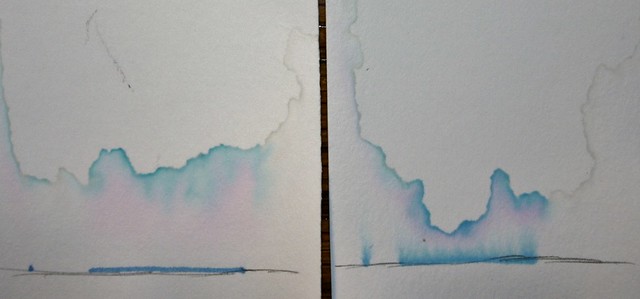
In the right corner we have Noodler's Blue and in the left corner we have Noodler's Liberty's Elysium battling for space in my teal Parker 51... this match was brought to you by on Hammermil card stock and Ozarka distilled water.


I am not a chemist... I am a teacher... This is more of a.... hobby... left over from previous work. YOUR MILEAGE MAY VERY... Like I said at the beginning, this is the start of something bigger I am trying to do, but it is interesting. This is not the most scientific or thorough part.

I have seen the battery of tests everyone puts these inks through, but what really makes ink fascinating for me is all the things that are going on to get us what we have going for us... beautiful colors with a myriad of properties.

To preform simple paper chromatography... I took ink and put a dot and a line on cardstock. The pencil mark is there to designate a starting point for the ink. The two samples sat in shallow glasses of 70 F water (21 C) ... they sat there for 5 hours wicking water through the paper. Then they dried.

The idea here is that paper is polar, non-polar components travel further up than more polar components.

Conclusions:

I have none yet... because I need to do a bunch of tests with different stationary and mobile phases. So anything I could say could be debunked in a matter of hours by anyone... even me... possibly... depending on the data

Here are my *current* observations.

1. Neither completely separated out.

2. LE has a vary bright turquise non-polar element that is very non-water-fast on cellulose

3. Noodler's blue is starting to give up its base color (and probably will in time) while LE finished separating out at its base and is holding fast.

4. Noodler's Blue seems to be a tighter (all components are similar) solution. LE seems like it has two distinct parts... the bright part... and the water proof part.

Again... I am starting to form ideas as I am doing this with all my inks... I have the summer offish (I am a teacher) I will catalog a lot of these things on my webpage http://tomvoboril.com check it out.... otherwise.... thoughts?

We often talk about trade-offs in inks... there was even a post about "impossible inks" I think the more we understand how this components interact with each other... the more we appreciate the magic of fountain pen ink... and the more we appreciate what we DO have...

Finally.... this was not perfect... from a long shot... but it started my gears churning, and if if gets anyone else thinking in the same direction... awesome...

20 June 2012

Noodler's Ahab With A Bock Nib


To start, I enjoy Noodler's pens as much as I enjoy their inks. I like tinkering with stuff. That's me. I know it isn't for everybody.

I have a number of Noodler's pens, and I like the flex nib. I am a teacher, and I write a lot, I wanted a workhorse nib. After getting a TWSBI 540... I started thinking how great it would be to have such a nib in the Ahab. I like the looks of the Ahab... the black just looks so.... striking.

After running across the posts mentioned above, I googled Bock nibs, JoWo, and looked at Knox and Burlow. I really liked the JoWo nibs, and I would love to support Brian Gray of Edison Pens more (no affiliation) but I couldn't rationalize a 20$ nib for a 20$ pen. I ended up at Indy-Pen-Dance (also no affiliation). For about 10$ including s&h and maybe 4 days of waiting... I had a new nib.
I decided the Bock over the Knox for two reasons... 1) the Name [I have been disappointed by too many cheap IPG nibs], 2) The Bock was silver... it fits the pen's hardware ... and it was less than 2$ more after the sale prices that Indy-Pen-Dance has going on.


It is a Bock 250 6mm polished nib. It sized up well with the Ahab's flex nib.


After reading about slipping, I did end up flattening the end that goes into the section, just a smidgen... it was pretty tight before I did that, now it fits perfect. You can see how the heels compare.


I really think it looks great...


I really like the smooth Bock nib. It is a medium (because that is what they had in stock)but I am ok with that. It is a good medium. It is finer than my Lamy 2000 medium, and I usually lean towards fine. It does have the slightest bit of line variation, but I would not call it flex. That is Rhodia grid for comparison.


I do feel like it is less of a nail than my TWSBI 540 fine. The only reason I can think is the difference between the 5mm and 6mm nibs. It has been discussed in other places that Bock does not make identical nibs for all their customers... so I am keeping that in mind too.

It seems like a pretty wet writer... not as wet as with the flex nib, not as dry as a TWSBI 540 or Lamy Safari. It starts without hesitation, even after being uncapped for a while. No skips. I have wondered a time or two if the breather hole in these nibs would not help overcome some of the feed problems people have had.

Anybody else doing some Noodler modding? A bunch of people talked about the "Executive" black Ahab (I think Fountain Pen Geeks started that) when it came out, how it was a "board room ready pen" etc... I feel like this completes the package. If you have had problems in the past, I think this alone raises the value and makes it a steal of a pen... I highly recommend.

18 June 2012

Rustic Farm Table

There are some fundamental realities in having health related diets... you can't afford an "oops" or just let one meal slide and do the fast food thing... because your in a rush.  The reality is, you eat most of your meals at home.  We eat most of our meals at home.  We have two small children and we don't watch much TV as it is... so all of our meals are at our dining room table.

We were given a wonderful table right before we got married... 5 years ago... it was a hand-me-down from some family friends and we cherished it.  The table was always slim and had rounded ends so it was hard to put more than two chairs on a side.  A few years ago, our toddler at that time smashed a napkin holder into the table and caused a small crack.  The crack spread and is now threatening the viability of the table.  The table has gotten wobblier (it's a real word) over time.  We have needed a new one for a little while now.  I asked Hannah to find what she liked and we would see what we could do.  

She liked the rustic farm tables, but there was no way we could afford the size and type she wanted... so I pondered... surfed the web... visited Amish furniture craftsman (no joke) and came up with a plan.  I also have the plans in a pdf -->> Rustic Farm Table Plans.  If you use the plans and the table falls apart on you... I take no responsibility, I tweak things as I go and make changes here and there.  Make cuts that are convenient for you.  I made this more durable than it probably needs to be... but I have two small children.  You can make it bigger, smaller, etc... use common sense.  Don't cut your fingers off... that is bad.


Trip to the Hardware Store:


For wood, I used whiteboard (read pine) for everything.  The 4x4s are pressure treated because that is all I could find when I went shopping, but this would also look swanky with 3x3 boards for legs

2-  1x12x6 (for the top)
2-  1x10x6 (for the top)
3-  2x4x8  (for the skirt)
2-  4x4x8  (for the legs... your going to cut them in half)
5-  1x3x4  (for the braces)

1 small box of 1-1/4 inch wood screws
1 small box of 2-1/2 inch wood screws
8- 6" carriage bolts with a washer and nut
12 - 1" x 1/2" brackets

paint, stain, and polyurethane for the way you want it (more on that in a bit)

Procedure

I started building the top.  Lay the 10" boards next to each other to form the center of the table, and the 12" boards on the outside.  This makes a nice 41" wide table. I cut the braces a little longer than the diagram shows, because I did not want a lot of lip sticking out, but I did want it to be extra sturdy. 


I would go a little longer than the 2 feet 5 inches... but when I drew it up I wasn't sure how much I would need. Try to put two screws in each. Use the 1-1/4 inch screws so that they don't poke through the other side. Use glue, don't use glue, it is up to you. I would at least put glue under the braces. if you have a router table, or a dado blade on your table saw... feel free to join them together with... joints.


Next, build the skirt. Cut the 2x4 so that they are long enough and wide enough to form a box bigger than your braces, but smaller than your table ... doh... thank-you captain obvious.


I used 45 degree cuts so that they boxed in nicely... you don't have to.  I feel like it is sturdier becuase of it, and I prefer the look... but that is me.  Use the 2-1/2" screws for this.  I put three per corner ... two on one side, one on the other.

Cut the 4x4s in half to make them more manageable ... or just cut them the length you need, depending on your setup.  I made sure I had one "factory" end to go on the floor because it makes me feel better.  The table needs to be about 29-1/2" tall, your table top surface is about 3/4" thick, so cut the legs to fit.  I made mine a hair taller so that the highchair can slide under the skirt, but short enough so that the toddler can still reach the table.  Mine is probably 29-3/4" tall.


Also, save yourself some trouble, and don't make the top of the legs flush with the top edge of the skirt, give yourself some room when you cut and attach because you don't want the legs pushing up the table top...  you want the top resting on the skirt.


At this point, make sure everything fits.  If you are ready to attach, use 1" x 1/2" brackets to attach the underside of the skirt to the underside of the table.  4 on each side, 2 on each end.

You have color choices.  I like the cherry on white.  


Wood top with black trim, or all stained are good options too.  I like cherry on white.

I kept the top and the base separate while I painted and stained. Hannah (my wife) did help paint the base... and she did a great job. The girls watched me stain.


 The completed project.


And it fit inside:


Noodler's Music Nib Neponset


I really thought I would keep this all to myself. I never want to rock the boat or start anything, but with the love/hate relationship the fountain pen community has with Noodler's Ink, I really wanted to share what I firmly believe is the most beautiful pen that has come out of Nathan Tardif's workshop.

It all started with a bottle of Noodler's Ink Baystate Blue.


I will be the first to admit that BSB is messy, it stains, and it has a mind of its own... but I love it. I think it is more vibrant than anything else you can put in a fountain pen. I know it is not for everyone, but I took the plunge and haven't looked back. I e-mailed Brian Goulet to see if he knew anything about the "tax-achusetts" label more than what the youtube video had talked about it. He told me to talk to Dick Egolf at Luxury Brands. Dick and I talked a few times. In the end, he told me to send it straight to Nathan... that was in October.

Fast forward to April and the close of the artist competition...


I was shocked... I have seen other people's neponsets and none of them seem to have the same material as this one... and I haven't heard of anyone with a music nib. I was even more shocked when I ran across my pen and my name in one of Nathan's post in the artist contest topic (Fountain Pen Network).

It is a true music nib with three tines.


My writing sample of it, does not give it justice...


Noodler's Neponset w/ Music Nib (Black Swan in English Roses), TWSBI 540 with a Fine (Green Marine), Schmidt EF nib in a kit pen (Noodler's Black), Noodler's Ahab W/ Flex nib (Baystate Blue)

For the sake of the name... I did copy down a piece of music I was learning for violin... happens to be the tune my wife walked down the aisle to.


It lays down so much ink, and the staff paper I have was really made for pencil... it is probably 20lb paper... I had feathering and bleed through. It was, none the less, an enjoyable experience.

It is definitely a smooth writer. It worked out of the box with out nary a problem. It has great flex, but I have no ability to write with flex. I had posted the following on the Artist Contest topic but I am putting it up again, because you can see more of the line variation.


I guess my point is, great things are churning at Noodler's... if you have been turned off in the past, I would challenge you to give them a second chance. I really truly believe that Nathan has more a mind to keep fountain pens and ink alive more than he wants to make money. For me, the willingness to send out all these pens... and to send me this beauty... dare I say a grail pen... is proof that Noodler's really just wants us all to be happy.

Again, I am not trying to pick a fight with the naysayers... I don't know any better way to say "Thank-you Nathan, I love the pen" than to get up on a soap box and wave it in the air.


UPDATE:

I forgot some comparison photos... I think these are the more common / identifiable pens I have


Platinum Preppy (this one has the highlighter insert... just gave away the FP) , Lamy Safari, Lamy 2000, Noodler's Ahab, Noodler's Neponset, Shaeffer 330, Noodler's Nib Creaper, Wearever Pennant, TWSBI 540


Uncapped... sorry the Lamy 2k is not the same size as the Ahab... things were not stable.

It is a big guy, it does stick out the shirt pocket a bit... but for such a beautiful pen... I am ok with it.

Comparing it to other pens on the Pen Data Page from VintagePens.com ... no affiliation... you can see it is a big pen. It is 14.7/15 cm long and about 14.9 mm wide. It is not far from the dimensions of the MontBlanc 149.. with some obvious differences... or course... The only other things that are close in size are the Conway Stewart Churchill LE (but it had flat ends), Namiki Custom Impressions (Also flat ends), Sheaffer Senior Balance (Very close appearance when you look at trim and clip.... and it is from the late 20s) Same thing with the Sheaffer Balance II.

I would love to see Noodler's turn this one into a vaccumatic... or a level fill... classic..


UPDATE:

Compared to the Noodler's Ahab


Neponset and Ahap ... classic Noodler's, you can see a ray of light through the tines of the neponset.


Music nib just would not fit well in an ahab... caps too small


Massive ebonite feed


Neopnset does have the double wall o-ring in the plunger. and it seems like it might be a smingen longer...


The thing barely fits in my case... not a huge collection in there right now.... a few are in a converted cigar case (its has never had cigars... but the fit is perfect) and a couple in the book bag.


UPDATE:


The images is a little rough... I have never done 3d pens before.... but I just had this thought in my head ...